Project summary
The client wanted his logo to reflect that he spends his days writing software as a freelance developer, but often gigs playing the saxophone on evenings and weekends.
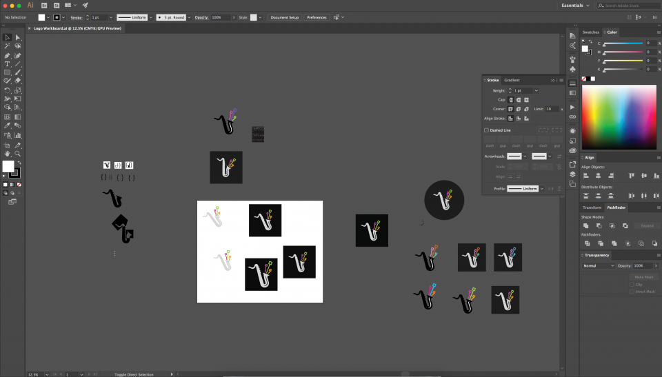
I drew a pure, stylised saxophone and used some “circuit board” graphics in the place of music notes. A unique hidden element is that the three circuits represent the client and his two small children.
The colours were carefully selected to work on both white and black backgrounds without being too shocking.
The process
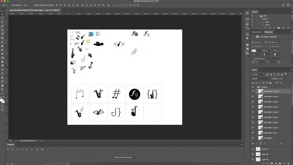
I worked with the client through the design process on the underlying imagery as well as colour combinations and spacing of elements to get the logo to a pixel-perfect state.


