Mobile and Web Application for Vets and Pet Owners
Platforms: iOS, Android, Responsive Web
Main Roles: Digital Product Development, User Research, Data Research, Cross-Platform UX Strategy, Mobile UI Design, Web UI Design
Additional Roles: Development Management, Video Production
Project summary
The goal of this project started simple in 2012 – to create an MVP that gave pet owners a place to store their pets’ basic health record information. From there, the project underwent three major phases of observation & change and integrated multiple third-party algorithms and devices.
About the client
Since 1952, Zoetis (formerly Pfizer Animal Health) has been at the forefront of delivering quality animal health products and services for owners and veterinarians. Their goal is to provide solutions to the pains of animal caregivers. We developed a suite of web and mobile application to help pet owners and vets collaborate to provide adequate care for their animals.
The challenge
To provide pet owners with a mobile application that integrated with Zoetis’ web-based vet application, to help them track their animals wellbeing in more detail than ever before.
This app had to be both clinically adequate for vets, and fun to use for pet owners. This combination was necessary if both parties were to get maximum satisfaction from the application. A user-tailored user experience was needed to achieve these goals, and I was tasked with providing this for the client.
The design process
I understood the role of thorough user and market research when designing high-quality products. I brought that passion and process to this project.
Understand and discover through research
Throughout the project, I held regular workshops with stakeholders, pet owners, and veterinarians to gain inside insight into what their daily responsibilities and challenges were. The app needed to stay both clinically accorate for vets as well as fun and engaging for the pet owners and their families. I kept up to date with demographic research on what other apps our target users interact with, including mobile games.
The data collected from these exercises provided insight into the features our target users needed, what they were looking to get from our product, how they preferred to use mobile apps, and the flows they normally follow.
Refine flows and UI design
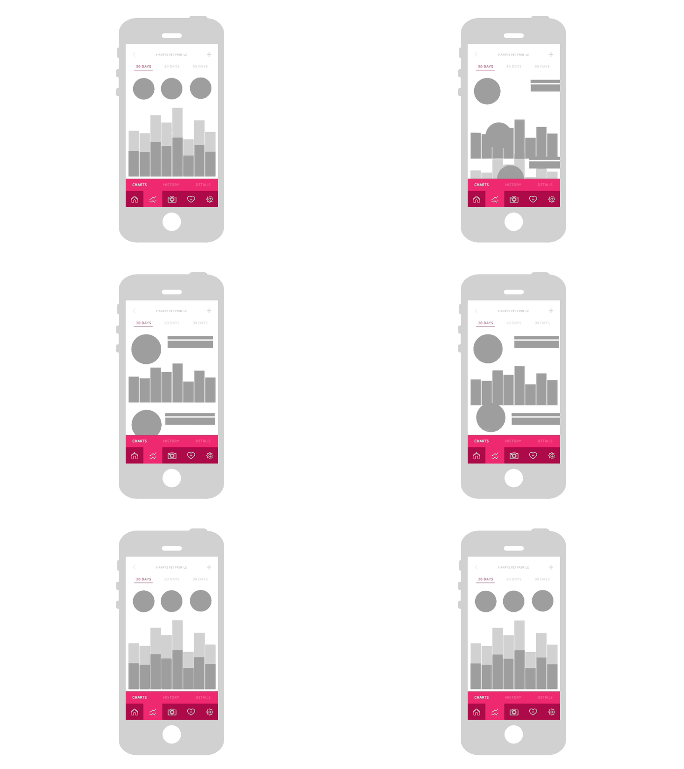
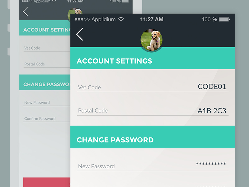
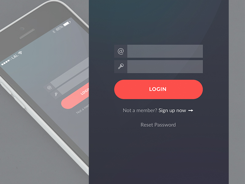
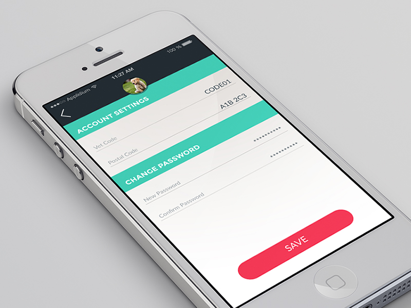
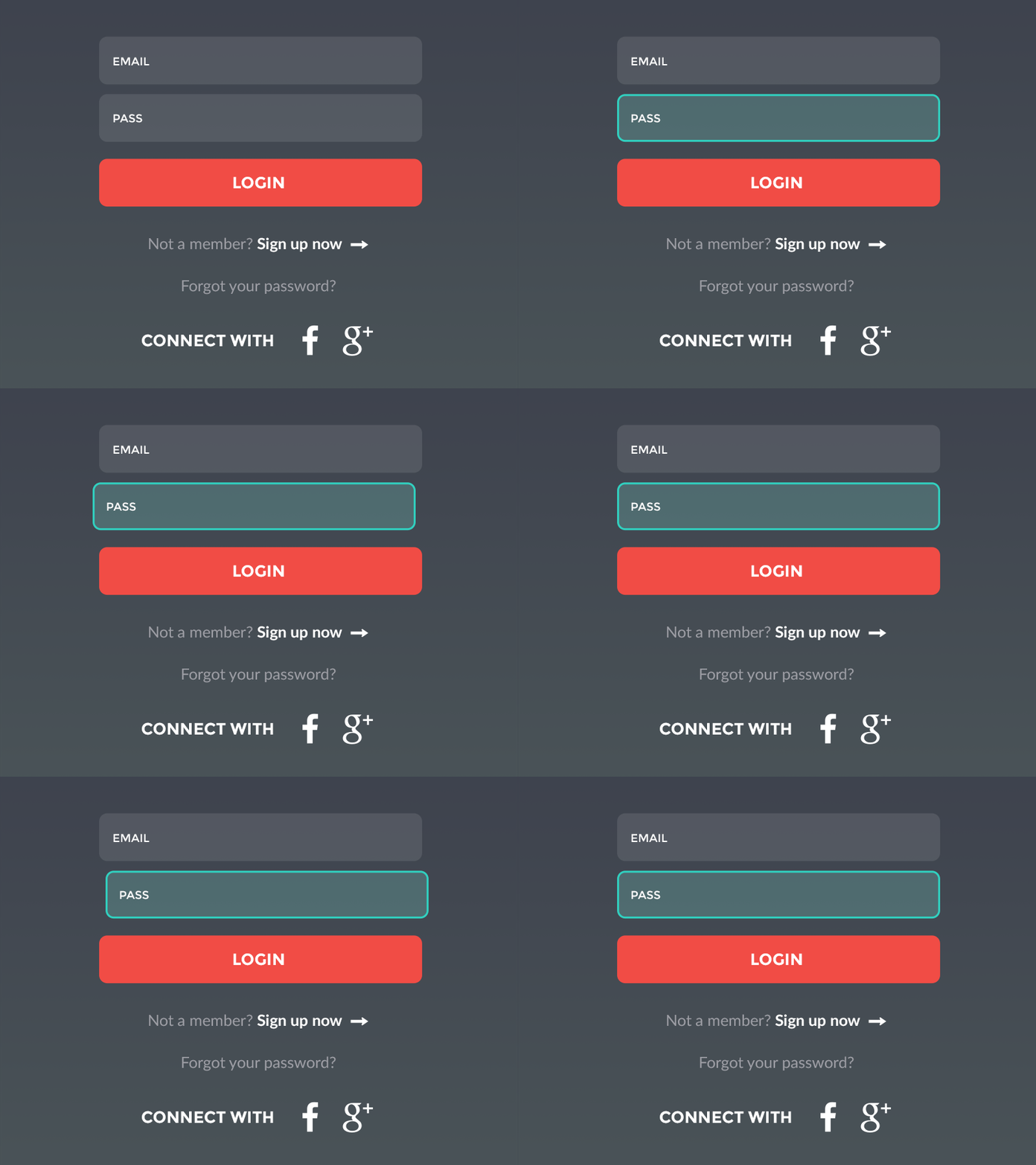
A picture is worth a thousand words, so an interactive mockup is worth a million! During the design process, there were a large number of stakeholders collaborating, which made it incredibly important to get UX / UI concepts and ideas across quickly and efficiently to audiences of all levels of technical competence and comfort. I produced many mockups and animation samples, as well as three versions of interactive prototypes using Adobe XD, Sketch, Invisionapp, Proto.io and Adobe AfterEffects.Initial Design Concepts
Building the app
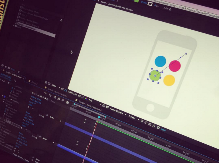
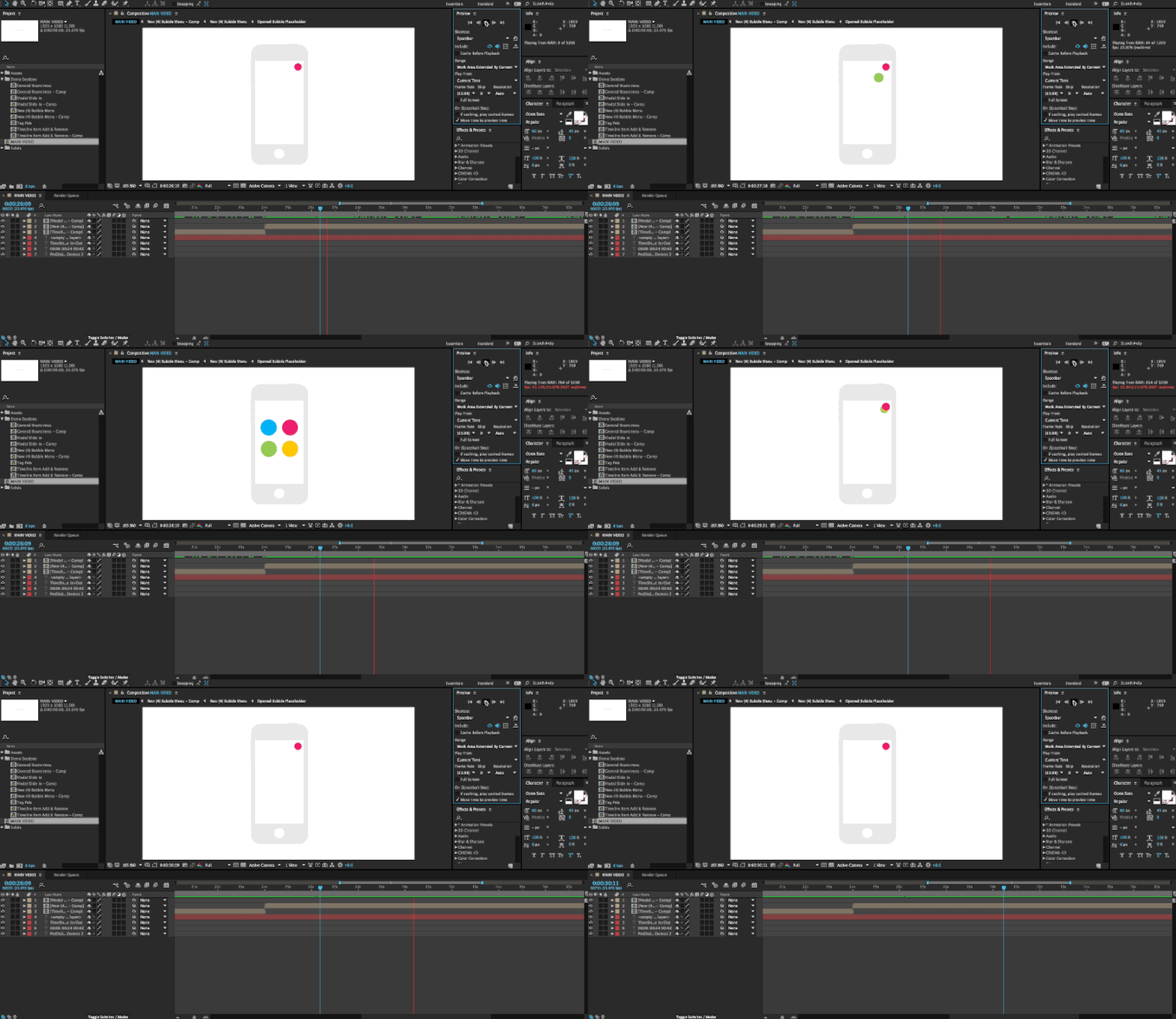
For interactions, I created storyboards displaying what all interaction stages should look like and how it should operate. When the features seemed too complex for words to properly convey, I created sample animations in Adobe After Effects.
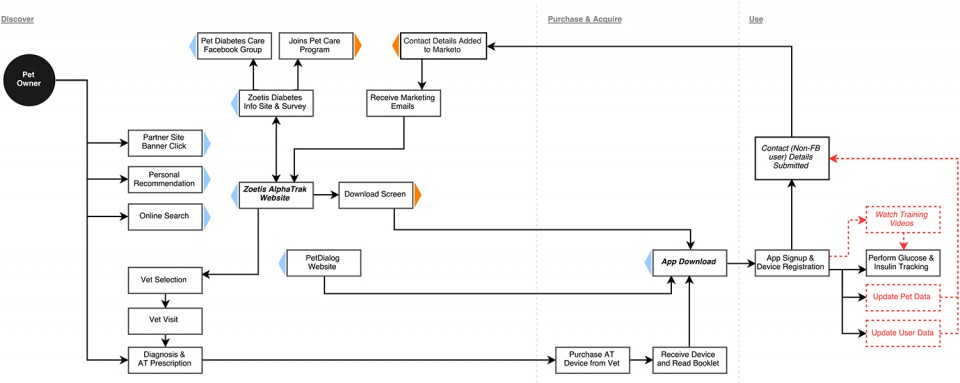
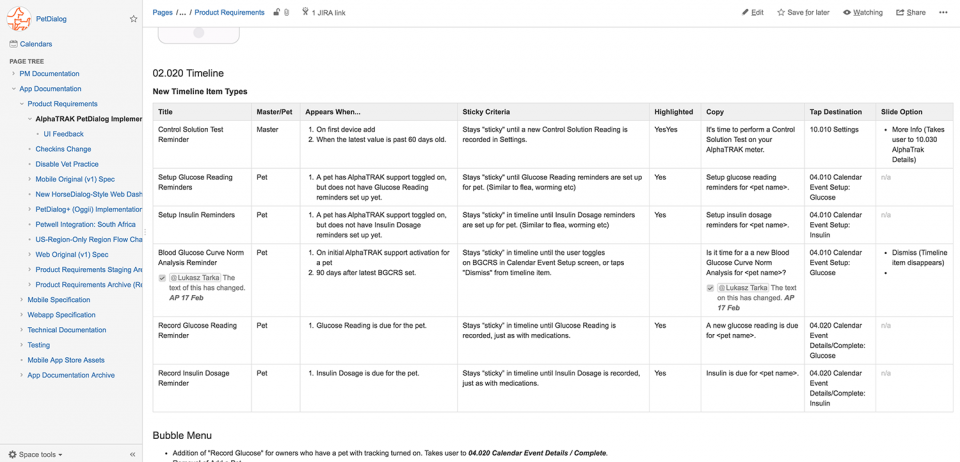
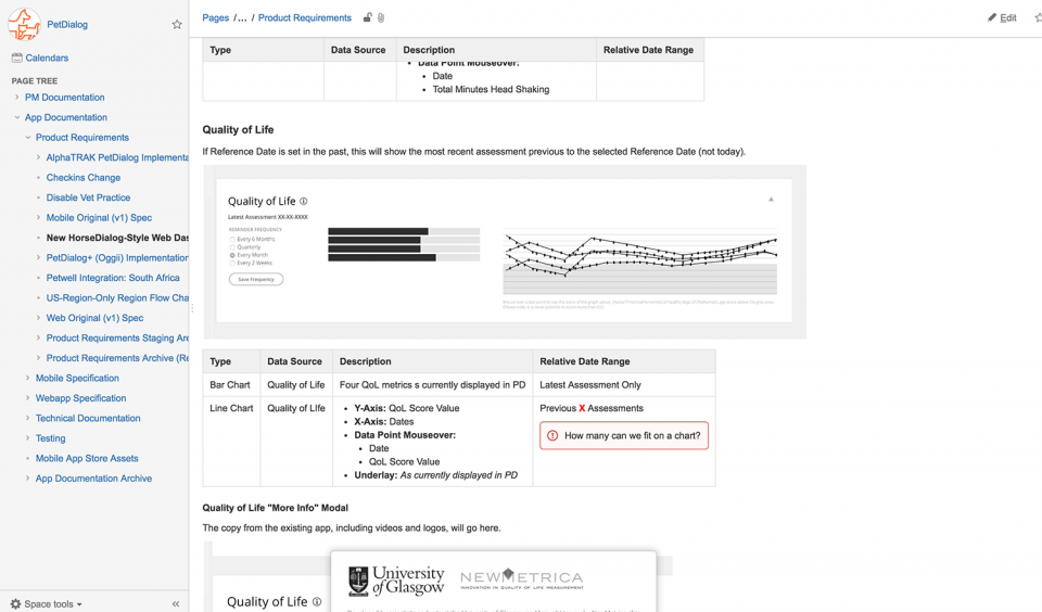
Detailed specifications are vital to the build stage. A simple misunderstanding of the spec can result in weeks of wasted time, and can blow a budget. I wrote the entire development specification for all features in the app, including flow diagrams, database schema drafts and a large number of use cases.
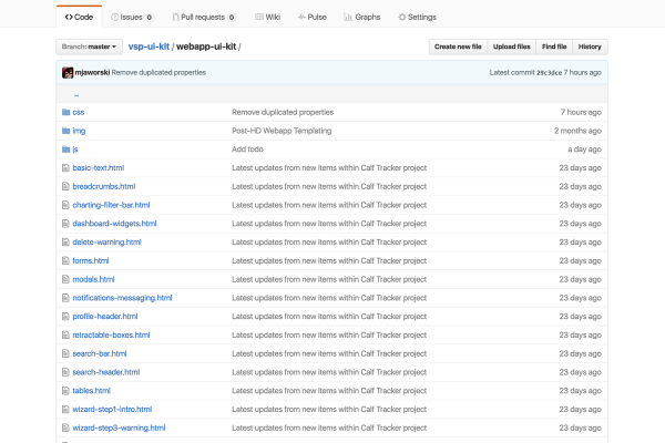
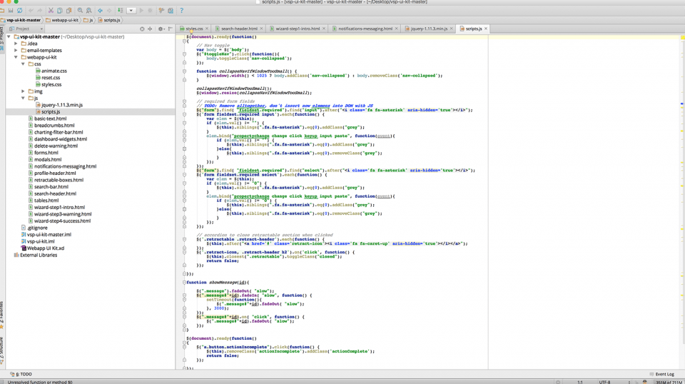
Converting a UI design into HTML takes time to complete, and requires a specific skill set to get it pixel-perfect. For the web app, I provided a GitHub repository with full HTML, CSS & jQuery templates. This saved a large amount of development time and ensured that the app would be built to the exact UI specifications.
I worked with the development team in Jira and Confluence systems during the build to answer questions and offer general support through launch. For the first two years of the project, I directly managed the development team of about 12 developers.
Additional deliverable - For Kids!
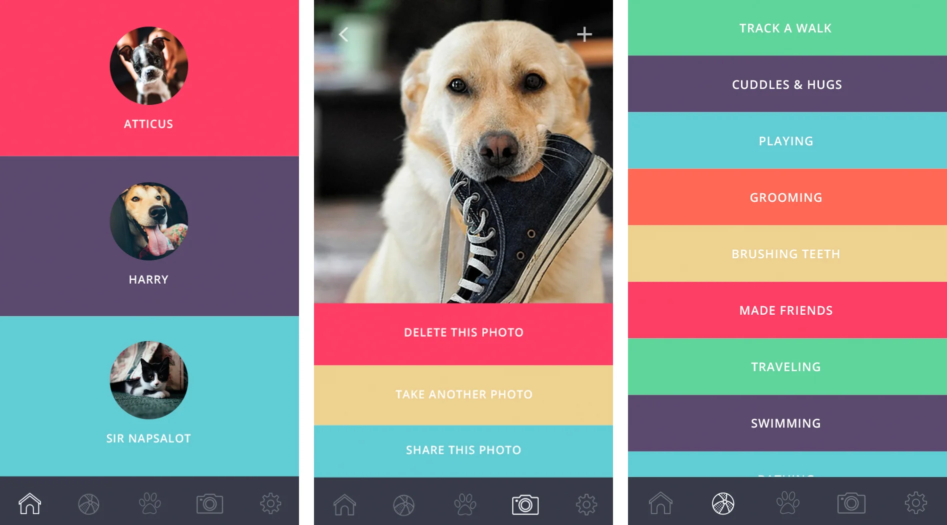
Although this sub-project never launched, it was a blast to do a little bit of UI design work on a much smaller, kid-friendly version of the app!
Branding and design language
After following a product from design to development, there is a risk of misalignment between the product and marketing campaigns. To ensure that internal resource and external agencies could both create assets that stayed on-brand for the app, I designed a full set of interactive branding guidelines that are available publicly for use in marketing and social campaigns.
Press and accolades
“The only ‘white label’ app that vet practices can tailor using their own branding, and market to clients as a completely new and user-friendly way of managing their pet’s health and well-being.
”
“The overall goal is to make the world of animal health as sophisticated as human health has become in adopting digital advances.”
“Interest was far greater than the company had expected.”
