B2C Veterinary Mobile & Web Application Suite
Platforms: iOS, Android, Responsive Web
Main Roles: Digital Product Development, User Research, Cross-Platform UX Strategy, Mobile UI Design, Web UI Design
Additional Roles: Branding Design, Front-End Development
Project summary
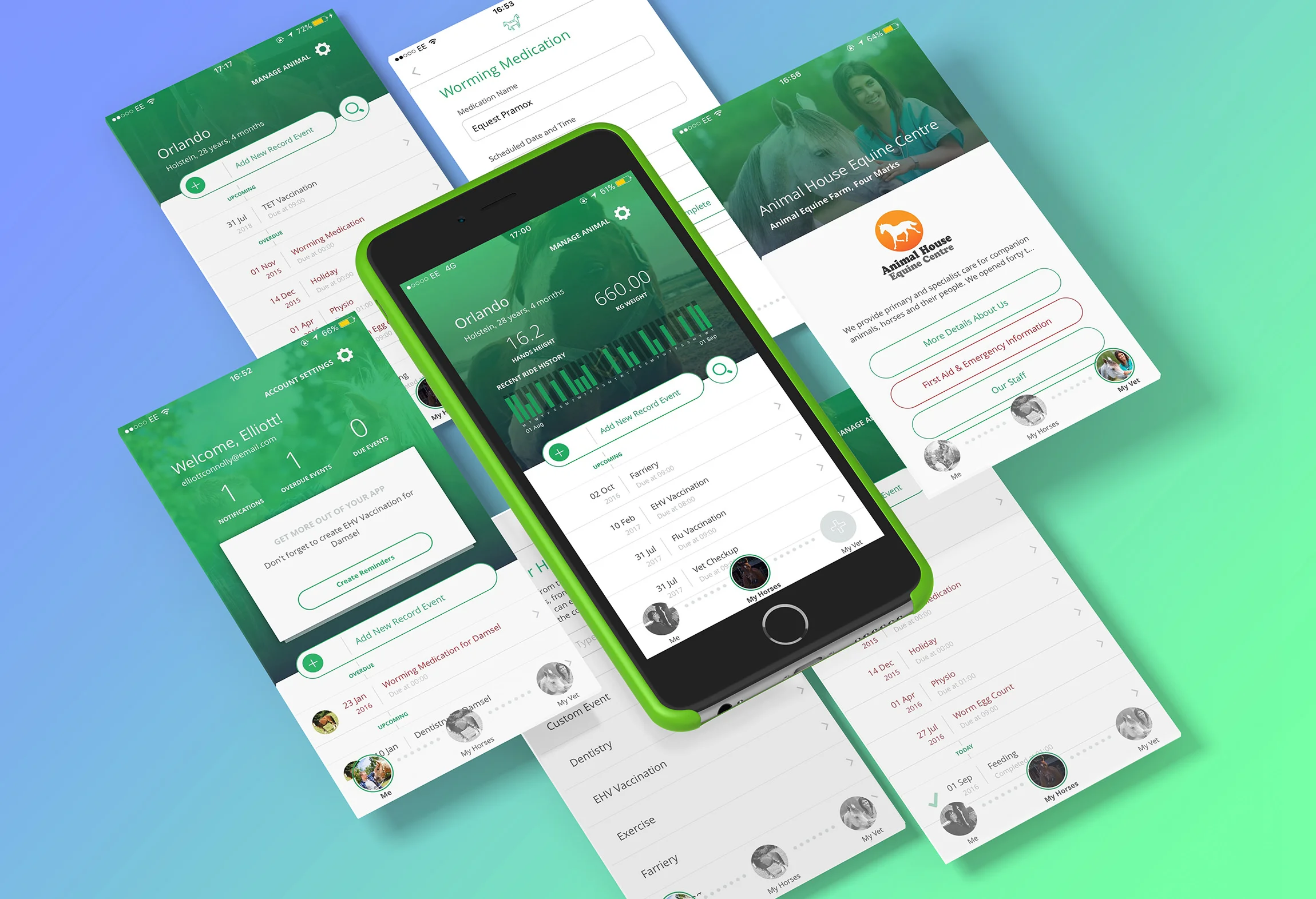
As the head of UX and product design at Zoetis Centre for Digital Innovation for over five years, I led the design of all digital products coming from the team. Horse owners are exceptionally emotionally attached to their animals. We saw a need for an application that could help horse owners and veterinarians collaborate in providing adequate care for these beautiful animals. With the app, owners could set reminders for important routines, and keep records of everything happening with their horses. Vets could know the state of the horse in real-time. I designed the full, user-focused product, including UI, for the application suite for Android, iOS and web users.
About Zoetis
Since 1952, Zoetis (formerly Pfizer Animal Health) has been at the forefront of delivering quality animal health products and services for owners and veterinarians. Their goal is to provide solutions to the pains of animal caregivers. We developed a suite of web and mobile application to help horse owners and vets collaborate to provide adequate care for their animals.
The challenge
“I had the pleasure to work alongside Ashley on a couple of projects for Zoetis LLC. I can honestly say that her vision, planning skills and in-depth knowledge of UX were key factors leading to the ultimate success of those projects. On top of that: great communication skills!”
To provide horse owners with a mobile application, and to provide vets with a web-based application, to help them track their animals wellbeing in more detail than ever before.
At the start of this project, Zoetis already had three applications for horse owners, but as our knowledge of our users improved and user requirements and preferences changed, these applications could no longer meet the expectations and needs of their users.
Horse owners needed a platform that could help them track their horse's health and get help from vets when they need it. Vets, on the other hand, needed a platform that would give them real-time insight into what the horse owner is doing, the health of the horse, and offer fast care without having to travel to meeting.
The existing applications did not meet these requirements, so a new application suite was needed to replace them. It was my job to produce the full product strategy and designs for this project.
The design process
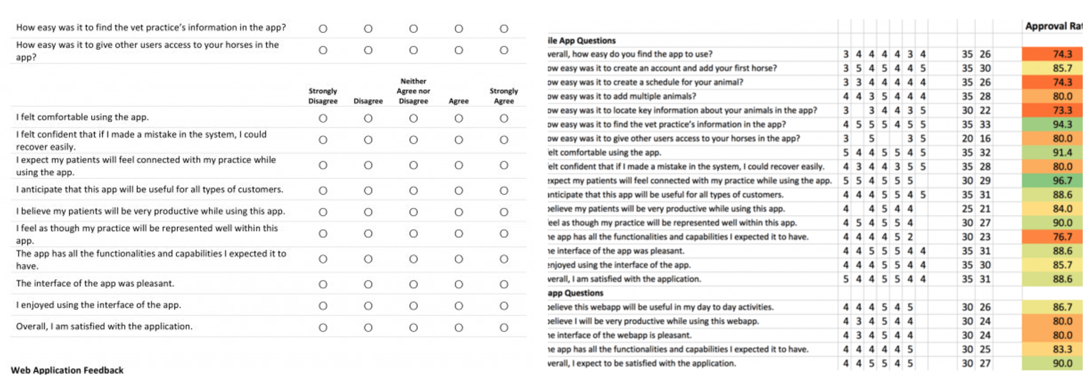
The only way to ensure that we’re satisfying our users is to research their behaviours, and really understand what they need, including how exactly they'll be putting your product to use. I embarked on a massive user research project to uncover this.
Understand and discover through research
The new product had to satisfy the needs of both the horse owners the vets. The first question I had to answer was, ‘What are the challenges horse owners are facing, in terms of keeping their horses healthy?”
While this was the overarching question, I developed a list of other questions that would help us build not just an app that owners can use to communicate with vets and take care of their horses, but an app that will provide a complete experience for the two parties.
Questions such as, “What motivates them to own and care for such large and high maintenance animal? How do they spend their spare time when they are not in the field?” and others.
I organised workshops for horse owners and vets to get answers to these questions. The answers obtained provided a lot of insight into the features and functionalities that horse owners and vets were actually looking for in a mobile application.
The results of this research gave me a lot to start designing with.
Refine flows and UI design
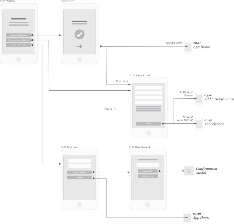
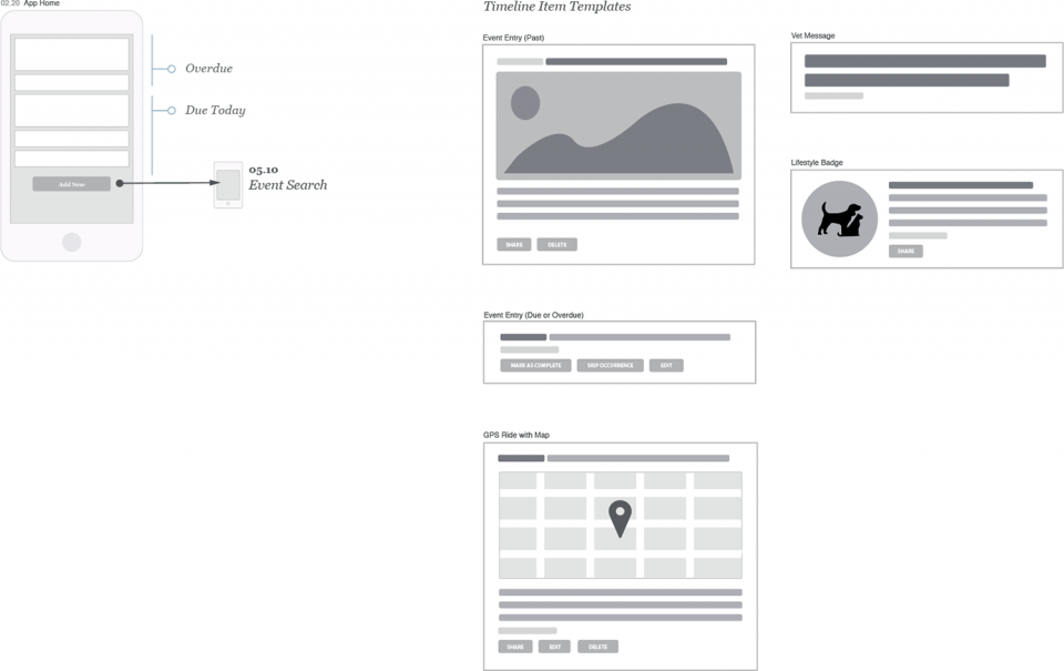
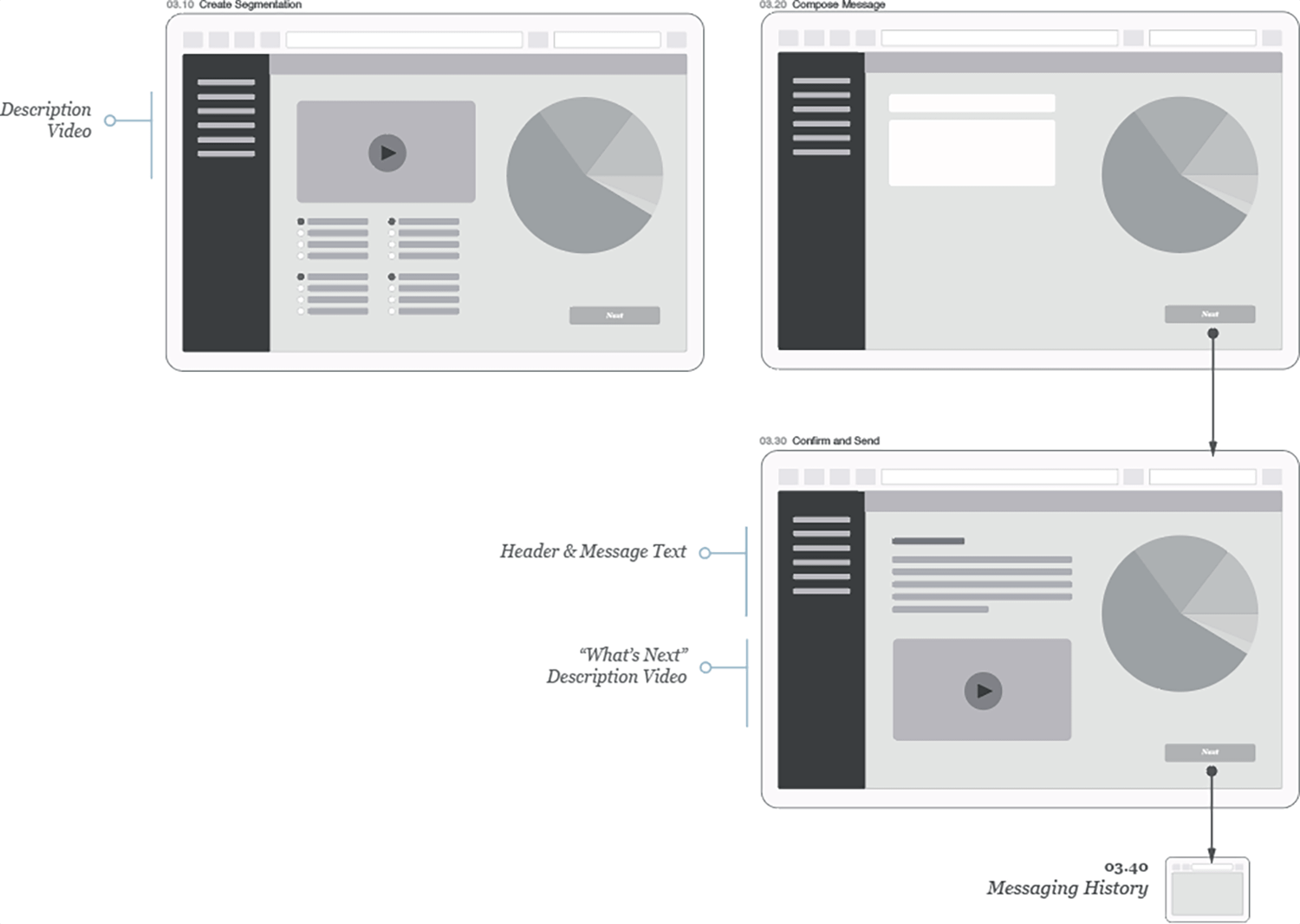
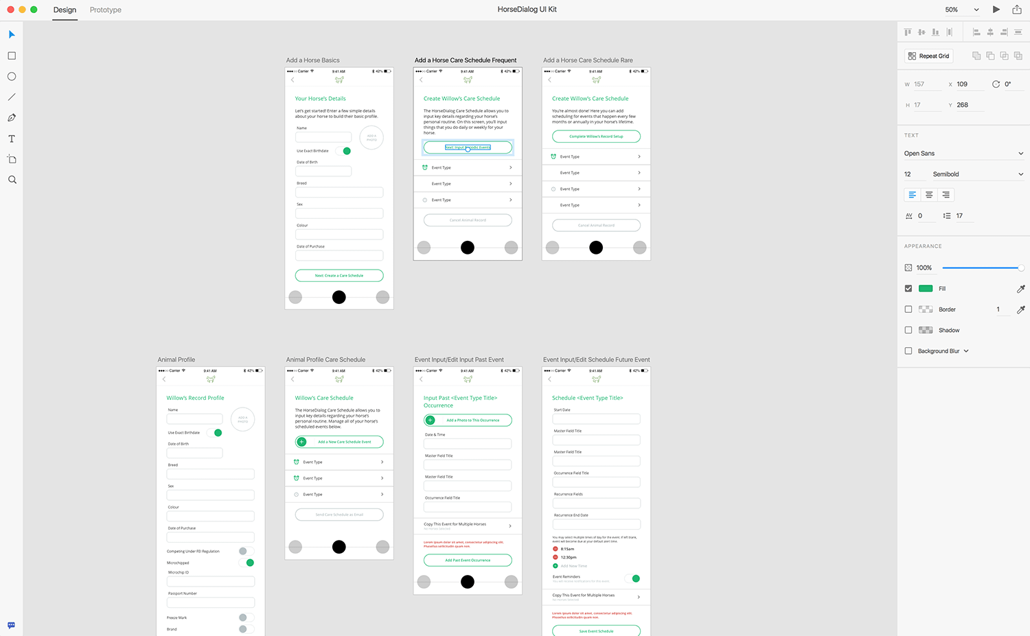
I used Sketch, the popular software tool, to begin the product designs. The insights gathered from my research gave me enough to get busy developing wireframes for the mobile and web applications. My goal with the sketches and wireframes was to integrate all the new features into a seamless complete experience for horse owners and vets.
The sketches and wireframes provided for both the clinical and emotional needs of the user. They also allowed for future integration of devices or external party services.
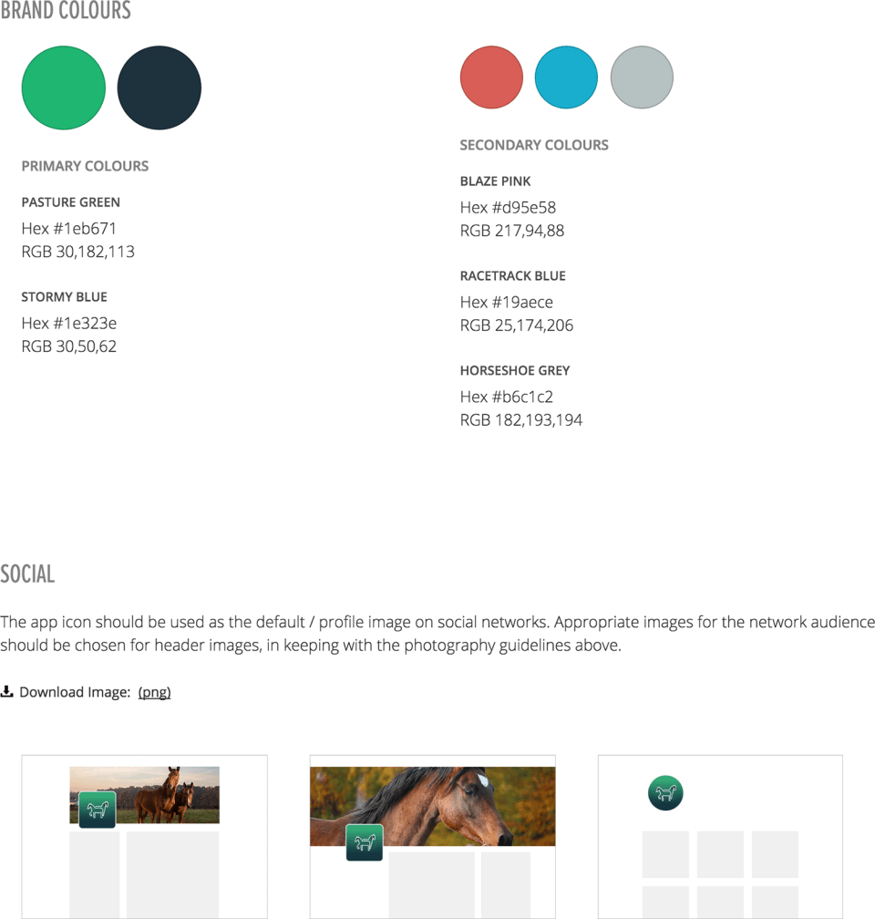
I began to visualise my sketches and turn the wireframes to actual designs. To ensure the development team knew exactly what they were working toward, I created a design language of templates, supplemented by some select individual screen designs. I attempted to cover everything down to the last detail, including colour specifications. I provided Adobe XD or Sketch files for each screen type, including detailed UX specifications for colours, fonts, etc.
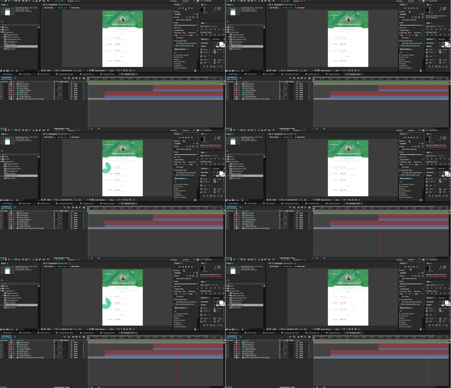
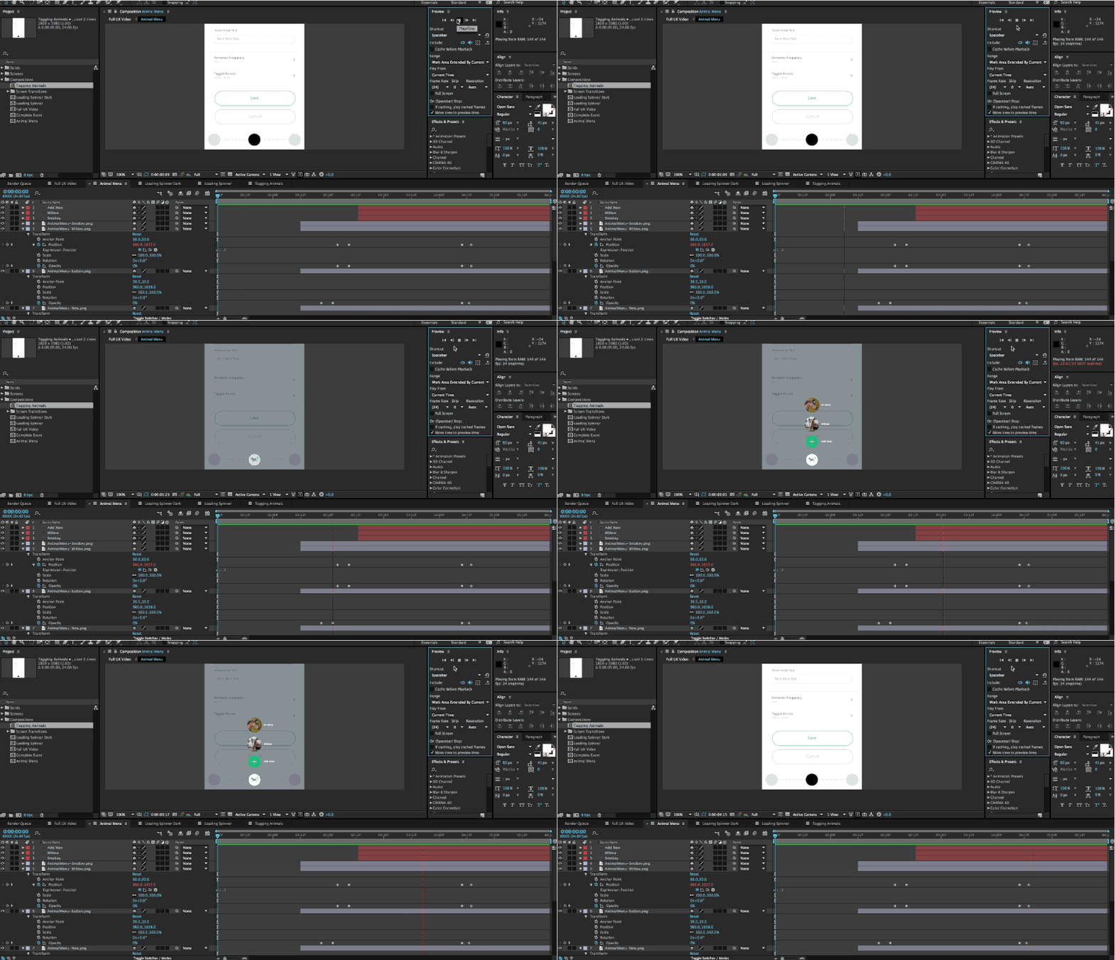
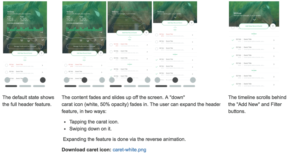
For interactions, I created storyboards displaying what all interaction stages should look like and how it should operate. When the features seemed too complex for words to properly convey, I created sample animations in Adobe After Effects.
Building the app
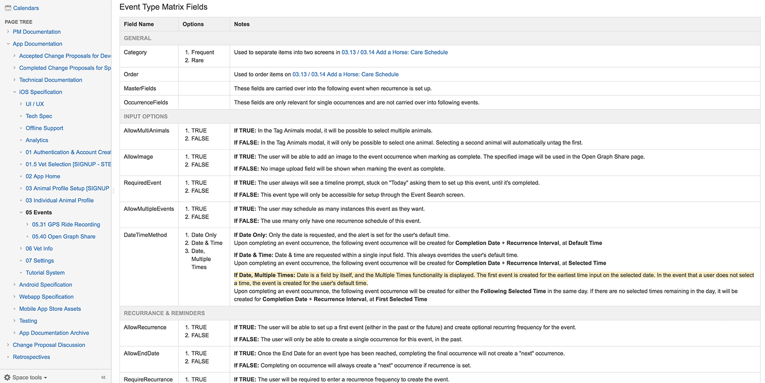
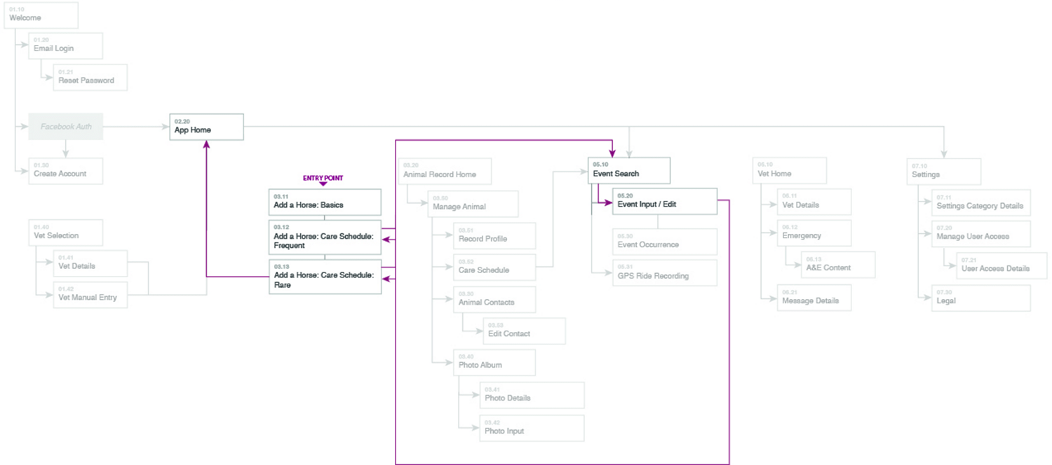
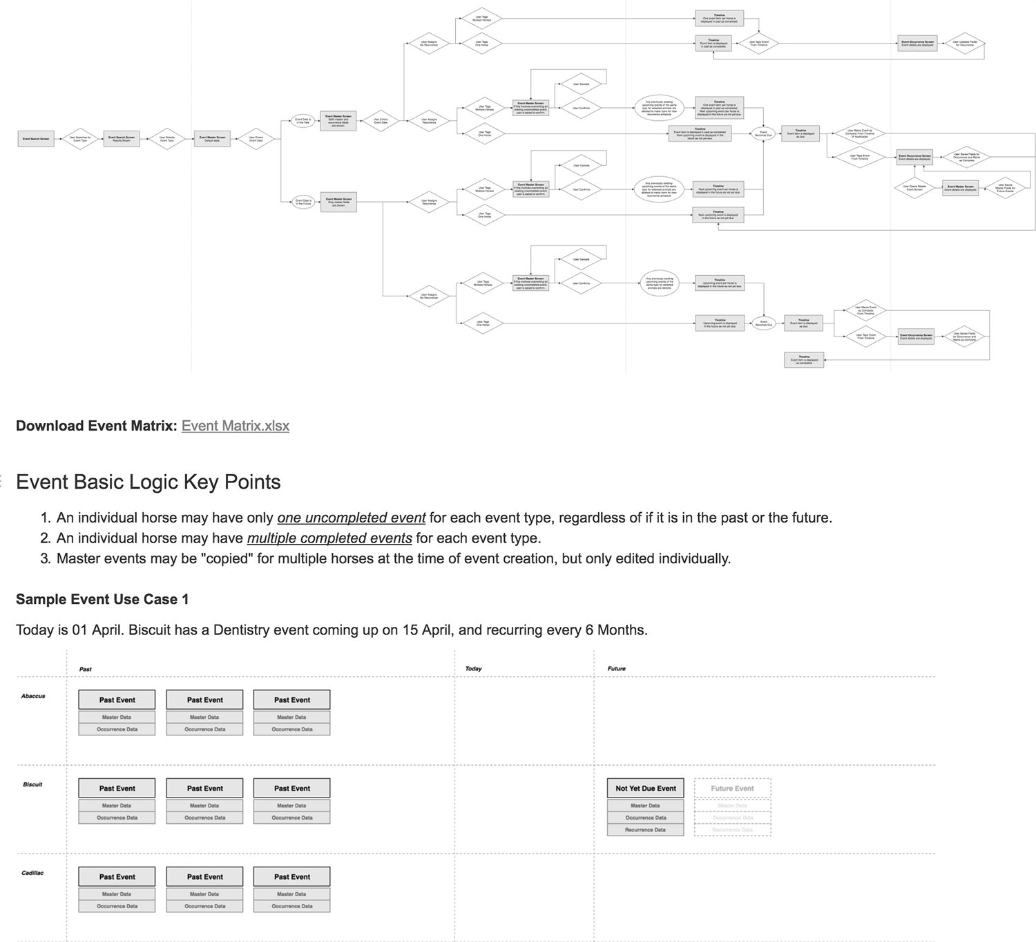
Detailed specifications are vital to the build stage. A simple misunderstanding of the spec can result in weeks of wasted time, and can blow a budget. The first version of this specification was about 7200 words. I wrote the entire development specification for all features in the app, including flow diagrams, database schema drafts and a large number of use cases.
Converting a UI design into HTML takes time to complete, and requires a specific skill set to get it pixel-perfect. For the web app, I provided a GitHub repository with full HTML, CSS & jQuery templates. This saved a large amount of development time and ensured that the app would be built to my exact UI specifications.
Side-by-side with Development
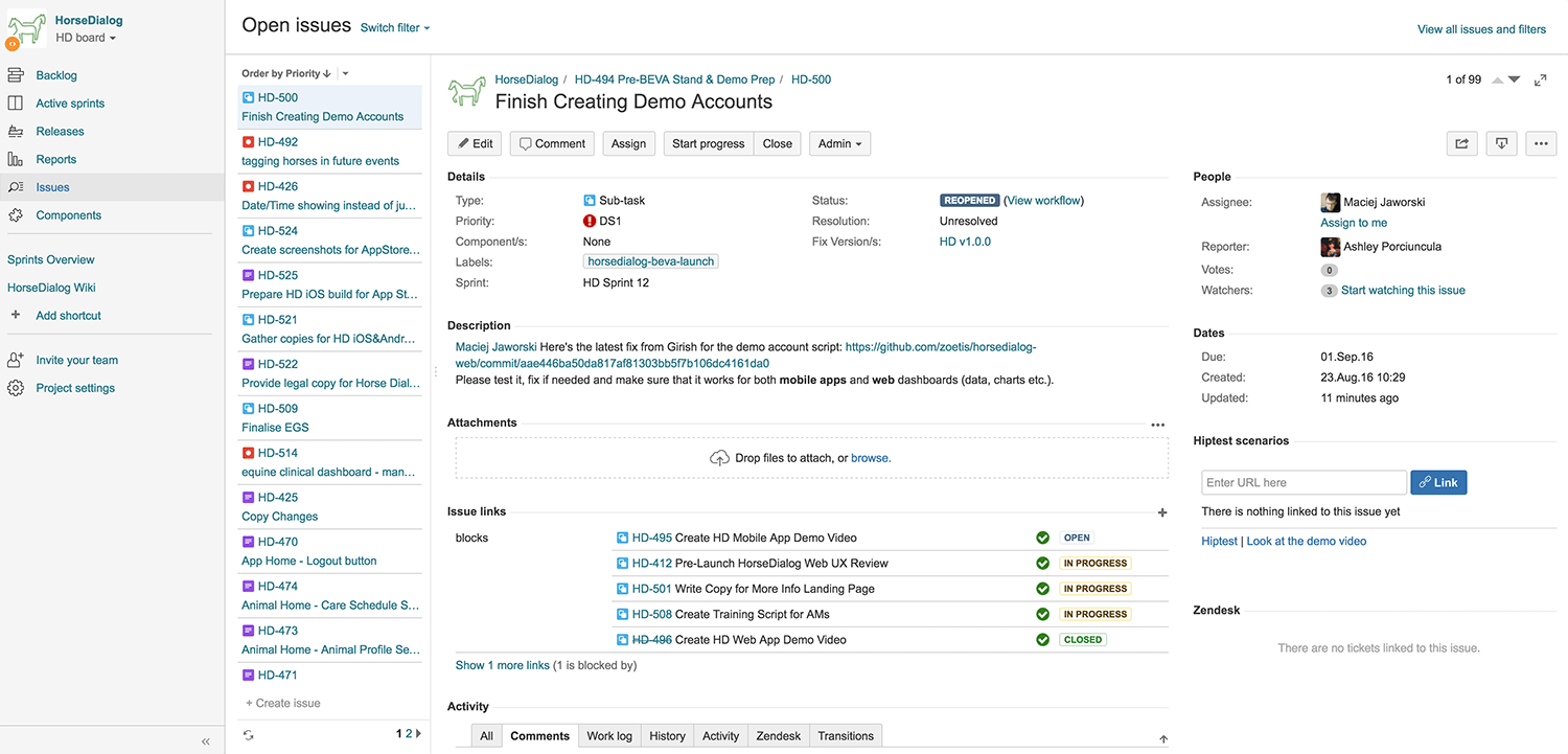
I worked with the development team in Jira and Confluence systems during the build to answer questions and offer general support through launch.
Insuring the future of the brand
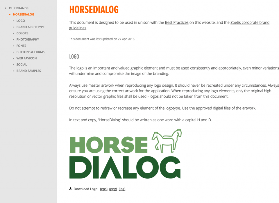
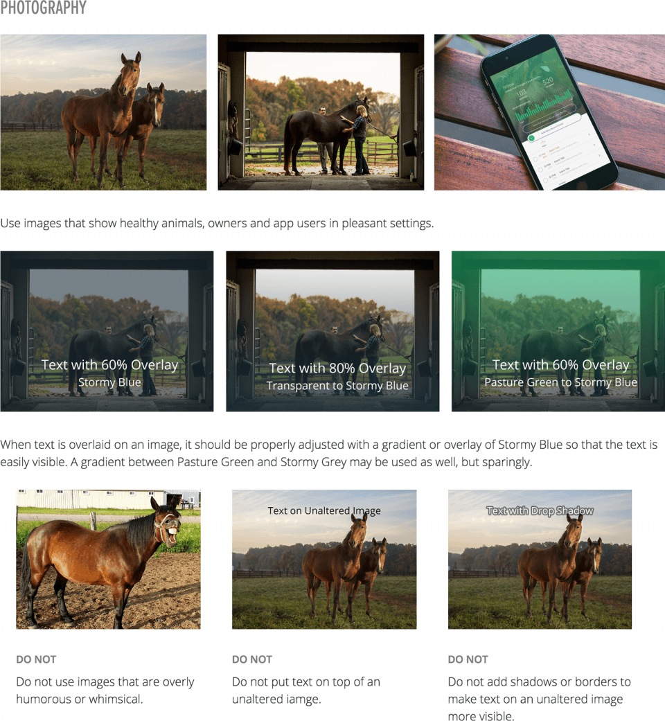
After following a product from design to development, the marketing team can sometimes have a difficult time producing digital assets that align with the product. To ensure that internal resource and external agencies could both create assets that stayed on-brand for the app, I designed a full set of interactive branding guidelines that are available publicly for use in marketing and social campaigns.
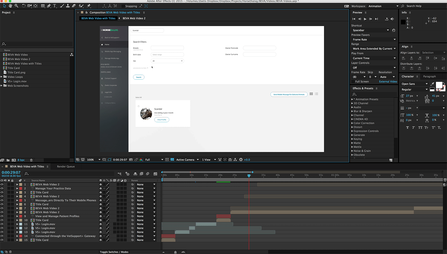
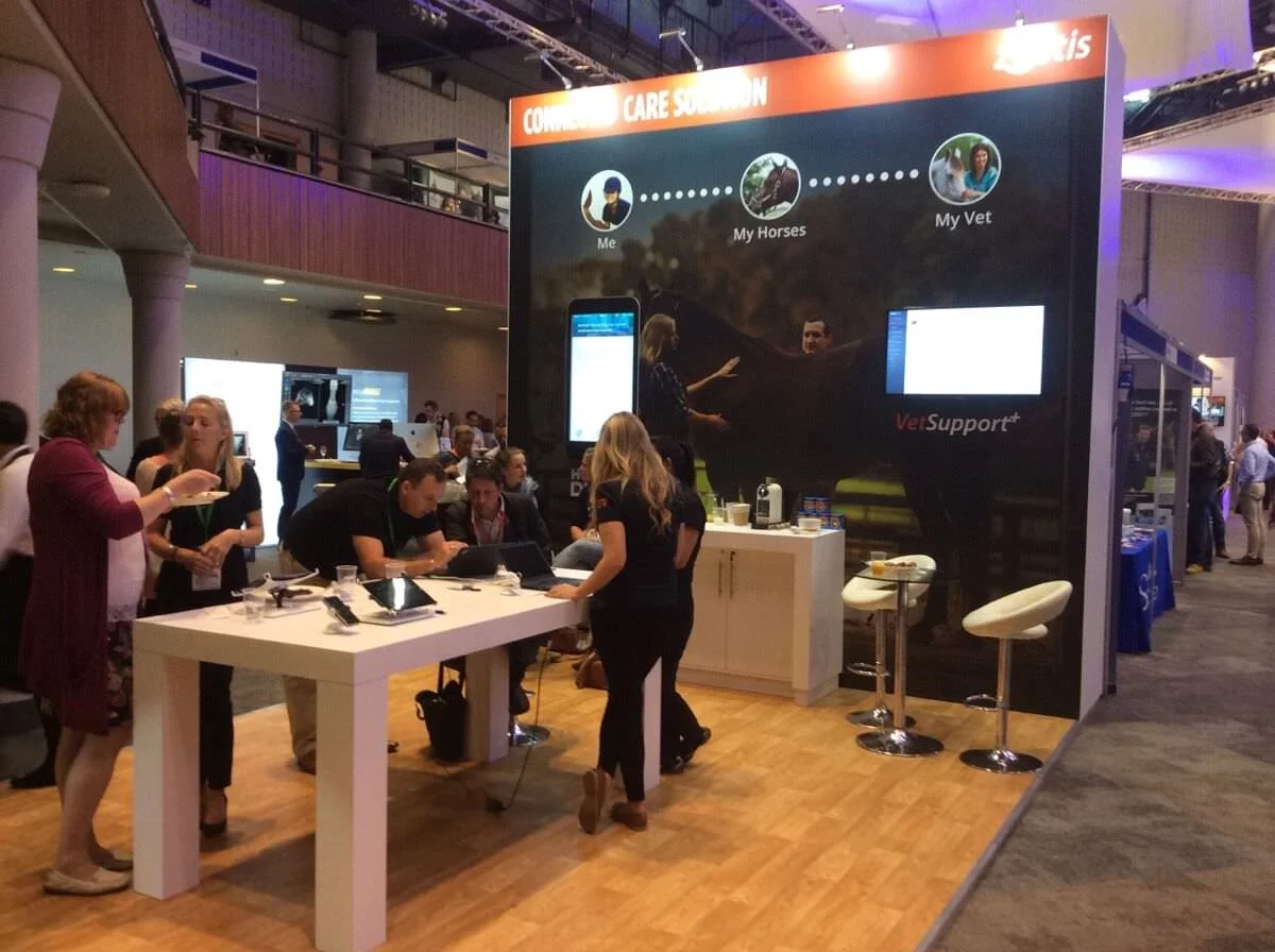
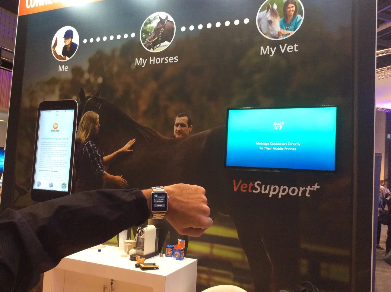
I also performed art direction over the creation of many campaign pieces, including a full trade show event for launch. I did a small amount of design support when necessary, such as display banners and also created display videos for the trade show in After Effects.
Results, press and accolades
The final product was a comprehensive suite of user-focused mobile and web applications that delighted our users. The apps also attracted positive comments from top magazines in the industry including Vet Times and HorseTalk. The app was also included in the DesignRush Best App Designs of 2023.
“A highly efficient way of managing their horse’s health and well-being.”
“Initially I was apprehensive that it would be time-consuming to input all the details but the design is so intuitive that it takes seconds to add updates.”
Links and more info
Product Website: https://www.horsedialog.co.uk/
”Zoetis' horse health care app out the gates” by Vet Times
“New app takes horse care and management to the next level” on HorseTalk


