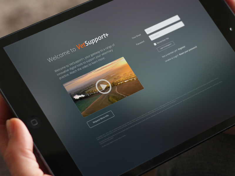
Veterinary Industry Digital Services Gateway
Platforms: Desktop Web
Main Roles: Digital Product Development, User Research, Data Research, Cross-Platform UX Strategy, Mobile UI Design, Web UI Design
Additional Roles: Development Management, Video Production
Project summary
My client had a number of applications and digital services that they offered to their customers. I was tasked with the job of unifying the user experience across all digital products.
About Zoetis
Since 1952, Zoetis (formerly Pfizer Animal Health) has been at the forefront of delivering quality animal health products and services for owners and veterinarians. Their goal is to provide solutions to the pains of animal caregivers. We developed a suite of web and mobile application to help horse owners and vets collaborate to provide adequate care for their animals.
The challenge
Although the client was offering an excellent selection of applications and digital services to their customer, they were spreading these apps across several disparate platforms, databases and authentication systems, without consistent branding. Our team’s mission: To unify the user experience of all products, giving users a single location to access daily for all of their digital services. The intention was to achieve ease of access, but more importantly to bring all of a user’s data together to offer a holistic picture of their practice, something they had never been given access to before.
This greatly affected the ease of access and led to a user experience with a lot of friction. My job was to unify these applications, as the sole designer for the new user experience.
The design process
Understand and discover through research
Great products start with asking the right questions to the right people. We began with a series of customer research projects to understand where the current solutions were lacking, and what customers remaining pain points were. Changing the daily behaviour of a user is no small challenge, so we needed to ask:
“What are the most popular features of our current applications? What features do we feel the customer misunderstands? Where do they spend time online when they’re not in one of our apps? What do they love about digital? What scares them?”
Vets are busy professionals, and do not have the time or desire to learn new technologies. This means that our solutions need to be extremely easy to use, and need to provide value enough to earn a small piece of their limited attention span.
Nurses are more tech-savvy, but because of the nature of their work, they may not have access to all the detailed clinical information that the applications offer.
Internal Sales Managers need access to certain clinical information for their sales calls. They also benefit from knowing benchmarks for surrounding areas and clinic specialties.
During the research phase, we held multiple discussions and focus groups with veterinary professionals, sales managers, pet owners, and farmers. We spent time on-site as well as in our offices, finding out how they already use technology, and more importantly, what prevents them from being fast adapters to new digital offerings.
Very few competitors had yet come into the digital space in any significant way, especially when it came to collecting and analysing data. We performed a competitive analysis of other digital offerings in the veterinary and pharmaceutical spaces. Because this client had initially been part of a significant human health corporation, we were able to branch out our research, taking learnings from the human health space.
Refine flows and UI design
Working stakeholders over several scoping sessions, features were brainstormed and prioritized, then condensed into a full wireframe workbook which received signoff before the final design phase. The final phase included detailed user flows and served as a jumping-off point for technical spec.
I needed to follow the client’s strict corporate branding guidelines for marketing websites, which were adapted to align with the unique requirements for digital products.
Building the app
Before development work began, I produced full HTML/CSS/JQuery templates for most screens, to ensure alignment between my designs and the final code. Doing so allowed us to have a hyper-functional static prototype to use to generate buzz around the project internally before launch.
Through the development process, I attended meetings and stayed intensely involved to ensure that UI/brand guidelines were followed and various responsive use cases were properly tested.
Video production
For authenticated users, a trailer video was made for each application within the gateway. I managed this portion of the project entirely, from writing scripts, selecting footage and music, selecting and directing voiceover talent, as well as doing all video editing using Adobe After Effects.
Links and more info
Platform Link: https://vetsupportplus.com/login/


